Dating Problems
Welcome to No Complaints, a newsletter by Browser editor-in-chief Caroline Crampton. Correspondence is always welcome: reply to this email or contact caroline@carolinecrampton.com. If you would prefer not to hear from me but stay on the list for other Browser emails, update your email preferences in your account menu. I am aiming to write to you here monthly; if you would like to hear from me more regularly you can do that on my personal newsletter.
In this edition: noticing the dating habits (or lack thereof) of internet publications.
As I read online every day, looking for potential material to include in a future edition of the Browser, I can't help but notice certain trends in the way information is presented.
There was the period post-"Snowfall" when every media outlet seemed to create an article layout emulating that famous New York Times multimedia feature. I still roll my eyes when a full page photograph, usually black and white, appears in the middle of a piece and I have to click and click and click to get through the single sentences that pop up to overlay it.
For a while, so-called "infinite scroll" pages were popular, which loaded the next article automatically as soon as the reader reached the bottom of the first, often awarding the site an accidental extra pageview or two. This mattered at the height of online advertising as a means of profiting from journalism, when being able to raise traffic numbers like this made a material difference in what advertisers would pay.
The advent of Substack, too, with its simple, one-column page design, has spawned imitators on other personal blogging platforms. Once upon a time, everybody wanted their Wordpress websites to look like magazines, and now we're back to linear blogs. This isn't necessarily a bad thing.
What all of these trends have in common, though, is that they were a mass movement of sorts, with everybody moving in the same direction to a greater or lesser extent. The latest online design change to catch my eye, however, seems more polarised. Some publications are doing one thing, others the absolute opposite. And it has to do with dates.
A fairly standard design element at the top of an article might be expected to look like this:

This, from the New York Times, is typical of how this information has been presented for some years now. It comes beneath the headline and standfirst and gives us the author byline(s), the date of publication and, in the case of a developing news story, a last update time. So far, so standard. It is minimal yet informative. You will find variations of this on many publications around the web.
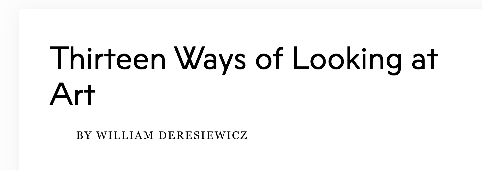
Except, some are choosing to remove some of this information by default. Take this piece, from the Skidmore College quarterly magazine Salmagundi:

No date at all. Scrolling all the way to the bottom will reveal a link to the "Fall - Winter 2023-2024" issue, but nothing further about when in those two seasons this piece was actually published.
Harper's magazine does something similar:

There is a "from the October 2024 issue" link in the sidebar, but no more specific publication date.
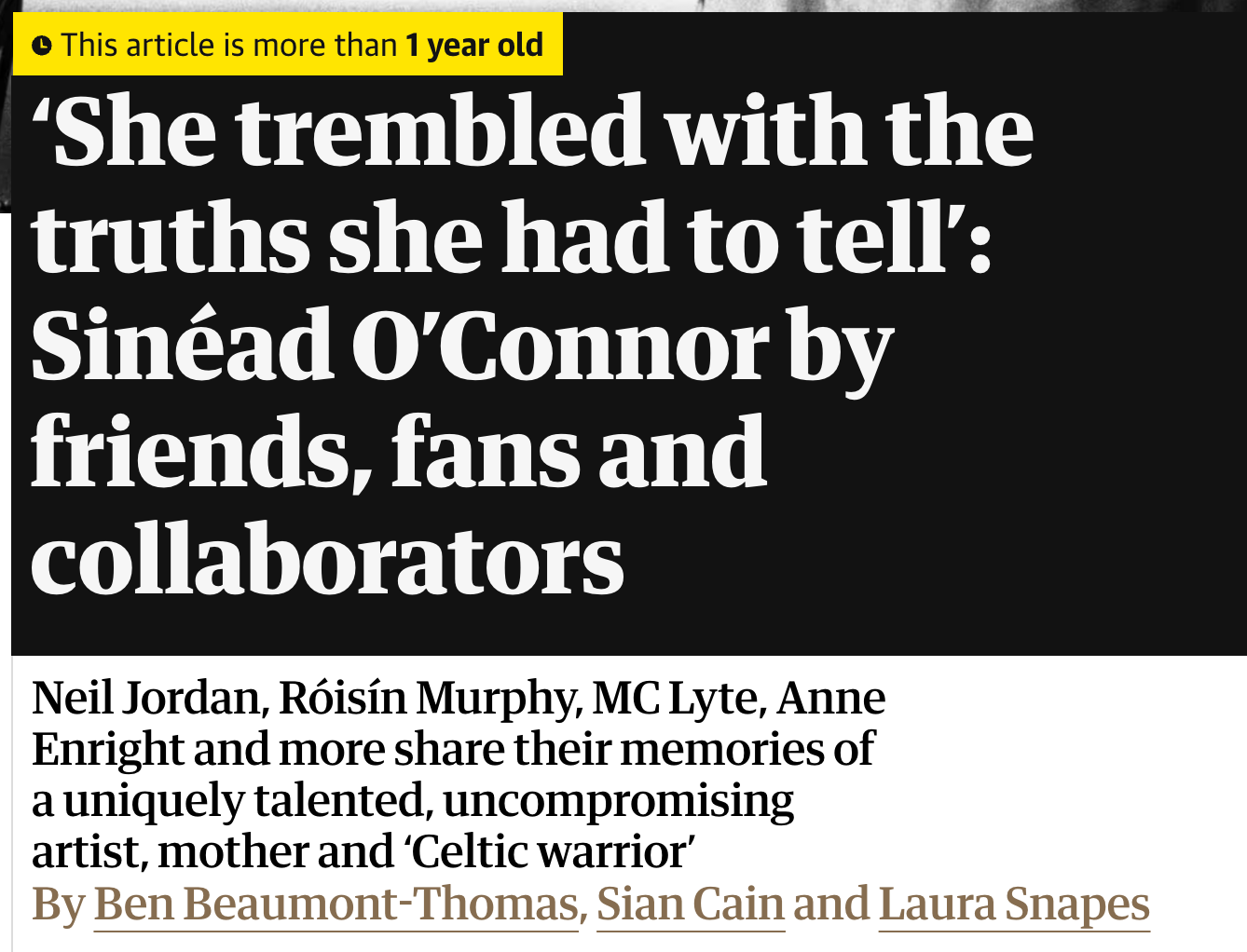
Meanwhile, other outlets are going in the opposite direction. Not only are they including the precise publication date on the article, but after a certain amount of time has elapsed, they add an additional design element to make sure the reader knows that this isn't a new or recent piece. Take this example from the Guardian:

I think this exists to try and prevent fresh social media outrage flaring up over a story that is, in fact, not currently developing. This is certainly more likely to be an issue for sites that cover breaking news, but I can see it happening for a monthly or quarterly publication too, especially if the piece in question is about a divisive or newly-topical subject. Given the increasingly context-less ways that we come to journalism, via links in newsletters or on other platforms, this emphasis on precise dating makes sense to me. And yet some publications are going in that opposite direction, harking back to a more timeless, print-inspired aesthetic that does away with the hectic page furniture of the 2010s web.
Does this matter? In a practical sense, it does to me and my colleague Kaamya Sharma, because we want the editions of the Browser we send to include accurate metadata about the articles we recommend, including their date. When a piece has no date on it, there are a few things I do to find one regardless.
Pasting the url into archive.org's Wayback Machine will show me the first time the page was archived there, which can be a strong clue to its original publication date. Looking up the url on Twitter can also be helpful (if less helpful than it used to be; the Musk takeover has not improved Twitter's linkrot problem) as a diligent advanced search can show the first time that a piece was tweeted. If that was done by its publication or author, that can be a reasonable indication of its date or origin. Finally, even the url itself can provide a clue, as some sites have a link structure that includes the date numerals. On rare occasions, none of this will work, and we will have to resort to whatever contextual clues the publication's latest issue or edition gives us, and tell Browser readers that a piece is from "September 2024" only.
I think accurate dating matters in a broader sense, too. The web is only becoming more atomised and less chronological. People are departing bigger platforms like Twitter in favour of less centralised alternatives. Algorithms, rather than date order, determine the presentation of our feeds. One historian of my acquaintance has pushed back against this pervading date-less-ness by beginning the caption of every post she makes on Instagram with the exact date; the rest of us just exist in the mushy vagueness of the recent past.
One day long in the future, I imagine a researcher trying to reconstruct a certain order of events and struggling. They will not be able to search a newspaper database by date as I can now and be fairly confident that what they are seeing is an accurate selection of the news for the chosen period. I can only wonder at what this might do to the construction of the past. History will be written not by the winners, but by those who chose to date their articles? Perhaps.
If you are not a paying subscriber to The Browser, and enjoy this letter, please do become a paying subscriber to The Browser, because that is how we are able to publish this and everything else that we do. You can also subscribe to my personal newsletter here.